top of page

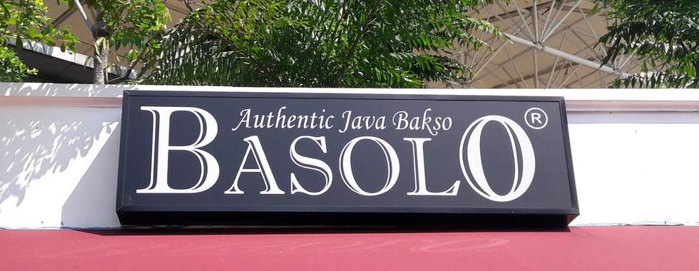
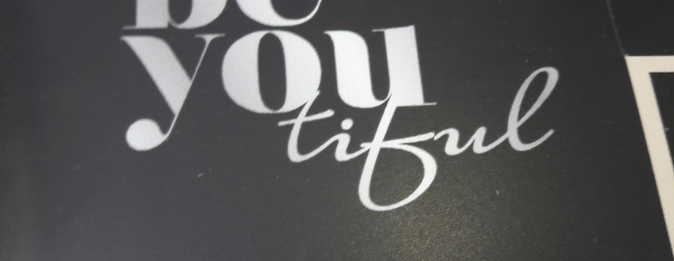
We did a research in The Breeze BSD about serif and sans-serif fonts. We took pictures of both type of fonts and group them according to their type. Here are the results:
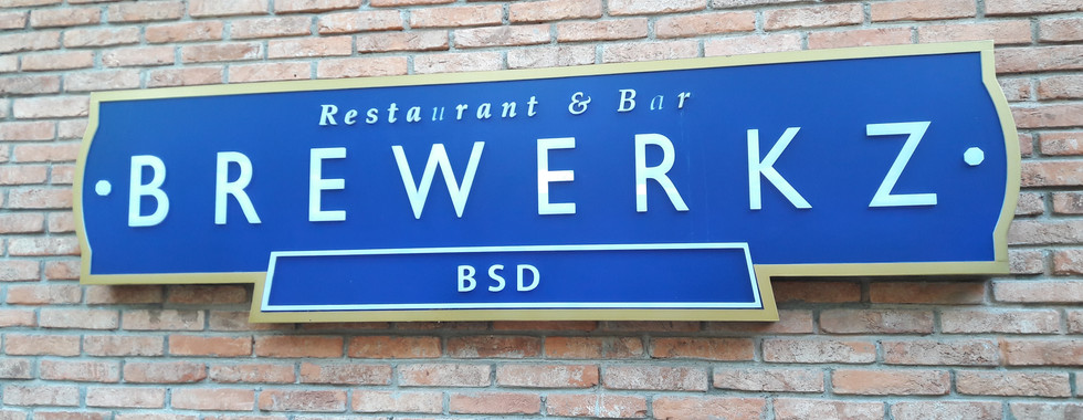

SERIF FONTS LOGOS


A small decorative line added as embellishment to the basic form of a character.The most common serif typeface is Times Roman.


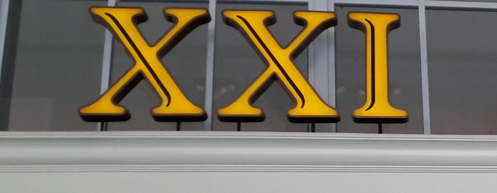
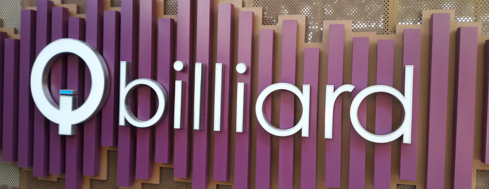
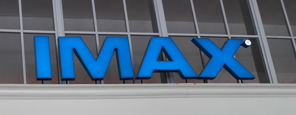
SANS-SERIF FONTS LOGOS


A category of typefaces that do not use serifs, small lines at the ends of characters. Popular sans serif fonts include Helvetica, Avant Garde, Arial, and Geneva. Serif fonts include Times Roman, Courier, New Century Schoolbook, and Palatino.


IKEA


This video is interactive and attracts people to watch further. The title of the video "recipes for delicious kitchens" makes the few first second counts which makes viewers enthusiast to watch it more. Instead of explaining the steps on how to choose and purchase their products in the mainstream way, IKEA creatively applied it into a cooking-steps-alike. The background music which sounds calming and fun at the same time supports the ad too. The voice and pronunciation of the demonstration is also clear and not too fast. It is a very creative concept to introduce their brand.

OREO


The overall of this advertisement is really catchy. The theme of this campaign is "Wonderfilled". According to the director, Mr Lukin, by sharing something “as small as an Oreo,” Ms. Lukin added, it can bring “a positive change.” One spot, which runs 90 seconds, asks if unpleasant characters like a TV vampire would be transformed for the better if someone shared Oreos with them. Would the vampire “not act so undead?” the singing narrator in the spot asks. “Would he thirst for milk instead?” Jorge Calleja, the group creative director at the Martin Agency who serves as the global creative director on the Oreo account, said he believed that the concept of wonder is “something the brand could own.” The illustration of this video ad is really pleasing to look at and its animation shows a lot of movement which makes our eyes follow them and not get bored. According to the comments on Youtube, what they love most is the song which is really catchy to the point that it is stuck in their head.

Mercedes-Benz


The advertising team brings together the pure wilderness of a lion and the stressful business world we are living in right now. The company shows in an impressive way the advantages of the new Energizing Comfort Control System that their product provides. The spot starts by showing the spectator that even the strongest and smartest business manager can have a really bad day. The business manager is represented by a human with the head of a lion. During his day there are several misadventures that happen to him. But now the highlight of the commercial is coming. After his stressful day the manager gets in his car, which is the new S-Class from Mercedes Benz. When the S-class stops at the first traffic light the manager presses the button, which starts the Energizing Comfort Control System. And from that moment the complete spot changes. It gets shown that the ECC system changes the music, temperature, smell, seat position and even the lights in the car. This impression is so overwhelming that it shows the emotion of relaxing. After his ride the manager gets out of his care and the views sees that he completely forgot his stressful day and that he is now ready to enjoy his evening. The ad has really good and creative concept. The effects of the animation and digital art is amazing as seen in the lion head and the effects on the lighting. The background music also supports the ad. In the beginning, the music is sporty, loud and fast but when it reaches the end it is calm, relaxing and at a slow pace which projects the emotions of the lion.

Apple at Work - The Underdogs


The advertisement is mainly aimed for the people at work. The advertisement is good because it seems like the viewers are watching a movie. There is the climax and solution. The camera handling is also great, it is steady and the movements provide extra emotion to the advertisement. The advertisement also shows how the Mac is really useful at work. It can be used for sketches, microsoft excel, and it is easily carried everywhere as it is light and thin. The background music also adds points to the advertisement. When they were in a hurry, the music is played in a fast pace.

CHANGE UP BY SEVENTEEN


Both the music and the video clip are great. The genre of the music is hip hop and the word "Change up" that keeps repeating makes the viewers hyped. The art directors also used bright colors such as red, orange, yellow, green and white with black that attracts the eyes of the viewers. The viewers will be awake and hype along with the song. The cameraman also changes the view and angles a lot of times although they stay on the same place which makes the video lively. How the cameraman also shoots from the mirror instead of directly is also creative. The studio is also set up with a bunch of props that are simple but arranged into something great. Such as the pile of papers, the giant CD player, and the chairs. At the last part, the director uses the play back technique on the m&m chocolate which shows the feeling of fun and happy. Overall, the effects are really great, the studio set up and props are stunning, and the music is catchy as well


We were given a task to research and analyse 5 artists, that is related to the creative industry, of our choice. Below are the artists and videos I picked and like the most.

5 Favorite Inspiring Artists


1. Naela Ali


She is a Jakarta based illustrator and graphic designer. Naela graduated in 2014 majoring in Visual Communication Design. She also writes on my spare time. She is focusing on making books and illustrated goods. She wrote and illustrated Stories for Rainy Days and Stories for Rainy Days Volume II. Own a brand named Asobi where she is turning my works into products.


Her Journey

Drawing has been her passion since she was little thus she decided to take Design as a major for university. She learnt a lot about the visual world but she knows illustrating is her favorite. Most of her works are watercolor paintings. As a child, she really loves Marisa Moss. The author of Amelia’s Notebook. She was the first one who inspires her to use watercolor. The simplicity and happiness of her illustrations grab her attention.


The moment she graduated from college, her parents wanted her to work in a company. She tried to work in a company, but I couldn’t. She said that being an artist is hardly called a job in Indonesia, so people tends to underestimate her at first. But she couldn’t work doing things she does not love wholeheartedly. So she decided to get out of working and start doing things independently. Now she focuses on her career as an illustrator. She made brand named Asobi and start selling her illustrated goods.


Nae's Artworks


2. Kate Moross


She is an art director, illustrator and graphic designer. Kate’s work spans across artistic direction, moving imagery, typography and illustration. In 2012, Kate founded Studio Moross, a London-based multidisciplinary design company as an expansion upon their own work and a way to collaborate with other creatives.


Her Journey

Kate got into design at quite young, at 19, and was already doing a couple of freelance bits and pieces. Now she is 30 which means she has been in the industry for 10 years. She went from being an illustrator to an art director. She did really well being an illustrator but she wasn’t satisfied with what she was doing.


She took the money she earned from illustration and started a record label and ran that for four years, releasing five records on that label. That allowed her to design record sleeves that weren’t illustration and turn her eyes towards music and music-related stuff, marketing and creating videos for the artists she had released songs for. That gave her the experience to do that for signed artists who were maybe larger and more in the mainstream. So she stopped doing the label and started the studio, and stopped paying herself to design and started to getting paid to design for other people.


Kate's Artworks


3. Daniel Chong


Daniel Chong (born November 18, 1978) is an American animator. A graduate of California Institute of the Arts, he is best known for Cartoon Network TV series We Bear Bears. Before creating his series, Chong began as a storyboard artist and animator for well known animation giants such as Blue Sky Studios, Walt Disney Animation Studios, Illumination Entertainment and Pixar.


His Journey

Daniel is no stranger to hard work and dedication, having story boarded for ten years in feature animation at studios including Disney, Pixar, Blue Sky and Illumination before pitching his ideas to various studios. His story demonstrates the importance of taking charge of your career and persevering through the ups and downs that come with company layoffs, mergers, films getting shelved, pitches being turned down and ultimately, crafting and creating a hit series for Cartoon Network. 


Daniel's Artworks


4. Chung Ha


Chungha (청하) was born on February 9, 1996). She is currently a successful South Korean singer, dancer and rapper. She finished fourth in Mnet's girl group survival show Produce 101, and is a former member of the now-disbanded South Korean girl group I.O.I.


Her Journey

She lived in Dallas, Texas, for 8 years before returning to South Korea to become a singer. As a result, Kim is able to speak both English and Korean. She auditioned for YG Entertainment and is a former JYP Entertainment trainee before joining her current agency MNH Entertainment. She trained for three years before debuting, and had been dancing for 6–7 years. She revealed on Hit The Stage that she almost quit dancing due to financial issues but she asked her family to allow her to continue as she was confident in it.

In 2018, Chungha became the model for the 2019 Jill Stuart Accessories collection. In May 2019, Sprite Korea announced Chungha as the new model and face of the brand and their Summer 2019 Dive in Sprite Campaign alongside actor Jang Ki-yong.


Chung Ha modelling, dancing and singing


5. Chris Burkard


Chris Burkard is an accomplished explorer, photographer, creative director, speaker, and author. Traveling throughout the year to pursue the farthest expanses of Earth, Burkard works to capture stories that inspire humans to consider their relationship with nature, while promoting the preservation of wild places everywhere.


His Journey

Chris was a self taught photographer and grew up loving landscapes. It was a subject that really spoke to him, but he knew it was not likely a subject that would earn him a comfortable living. It wasn’t until he started blending his landscapes with people (and surf) that things really started to pick up steam. He approaches his work hoping to evoke emotions and inspire viewers to desire to go there. This epic blend of beautiful seascapes with a dash of action has been Chris’s recipe to his image making. It’s a style that Chris has figured out and he’s running full speed with it.


In the early days, Chris’s work was well received and attracted positive buzz. Chris got out and did as much as he could picking up big named clients such as Apple, VW, and Nikon. He kept shooting and continued to network. Chris eventually became the senior photographer for Surfer Magazine, but things didn’t stop there. He realized to get to where he wanted to be, he needed to make his voice heard. Chris shared images across as many platforms as he could, worked with key brands relevant to his work, created videos, focused on social media, and entered his images in photo contests. A big break came in 2010 when Chris submitted several of his shots to the largest adventure sport photo contest in the world, the Red Bull Illume. That year, he became the overall winner taking home a $40,000 Leica S camera kit as the grand prize and even more important, a boost in forward momentum.


Chris's Artworks


bottom of page