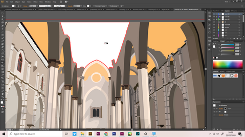
Stamp Postage Design
- Jan 27, 2020
- 1 min read
For the term project, we were assigned to do a stamp postage design.
Carmo Convent in Lisbon, Portugal was the landmark I chose
Moodboard
In the moodboard, I included pictures of the place, stamp design references, the font reference and the color palette.

Sketches

Picture for tracing
This is the picture I used for tracing on illustrator.

Progress
Final Tracing outcome

Coloring Progress
Adding shadow to the artwork
Changing the color to orange for sunset version. I added another layer and color it orange with reduced opacity for the sunset feeling.
Changing the color to dark blue and added another reduced opacity layer with the color dark blue to create the night feeling.
For the night time artwork, I also added stars and used the flare tool to make it glow. I watched a tutorial on Youtube on how to do this.
Final Results
Around Dawn

Sunset

Night

Making the stamp
To make the stamp shape itself, I followed the assignment instructions by making a rectangle and circles (copy using ctrl+D), and use the minus front pathfinder tool to combine all the selected shapes and takes the top objects and removes them from the bottommost object.
Next, I added the artwork and the details of the stamp using the font I chose which is Portuguesa.
Final Stamp Design

Collectibles Design
For my collectibles design, I make a flip packaging.
I applied my tracing and changed the color to white for my collectibles packaging. I set the background color to #C6B6A8 to match it with the Carmo Convent building color.
For the page inside, I added Carmo Convent's brief information on top and place the stamp collection on the bottom.
Final Design with Collectibles


Comments